
CASE STUDY
DEPARTMENT OF THE INTERIOR WEBSITE REDESIGN
An independent project focused on redesigning the DOI's website to better communicate their purpose.
Click HERE to view the Google Slides document with all of the deliverables required for the project, including
User proto-persona
User path
Improved Sitemap
Style guide
High-fidelity clickable desktop & mobile prototypes
RECOMMENDED
The Department of the Interior has an overall functional website with self-explanatory navigation and features, but lacks character & style, page consistency, and key context, such as what the DOI's purpose is. The goal of the project was to update and modernize the DOI's homepage, fix UI issues, and make it clear to website visitors what the Department of the Interior does.
PROJECT OVERVIEW
TEAM SIZE: Individual
MY ROLE: UX/UI Researcher, Designer
TIMELINE: ~5 weeks
TOOLS: Figma, Google Drive
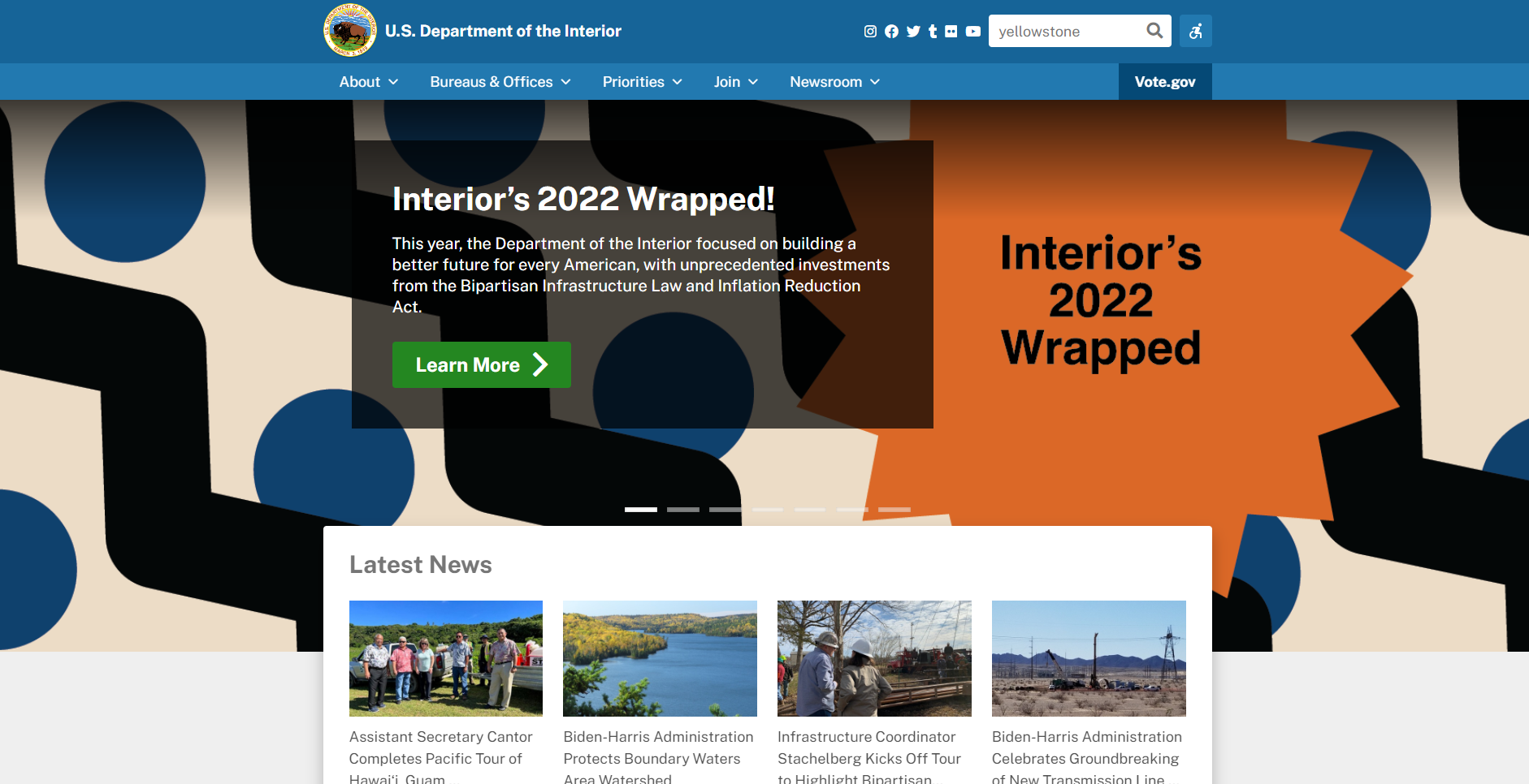
ORIGINAL DOI HOMEPAGE
The first testing was completed among a group of fellow students who came together to analyze the DOI's homepage. Initial observations were that the page had a confusing content/text hierarchy, mismatched color scheme, and that the overall website lacked consistency between pages. Later on, a user test was conducted and included key takeaways such as the image in the featured article played a key role in helping the user to understand what the DOI's purpose is, and that 'self-explanatory' navigation is important and easy to understand.
USER RESEARCH
The defining issues for the DOI's homepage was lack of key context, an unclear color scheme/UI style, and an outdated webpage layout, albeit acceptable functionality-wise.
DEFINITION
Ideation began with gathering inspiration materials such as images, color schemes, and UI designs. The overall webpage design had to match and communicate the DOI's purpose.
IDEATION
Prototyping was done in Figma and ended with a high fidelity desktop and mobile clickable homepage prototype.
PROTOTYPING
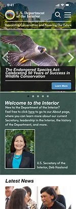
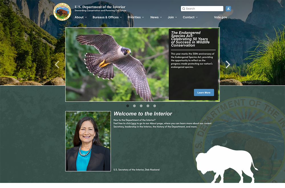
REDESIGNED DOI HOMEPAGE
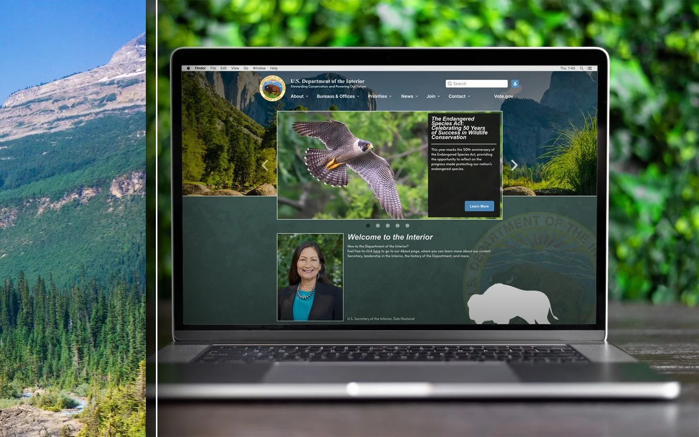
The final redesign of the Department of the Interior’s homepage does a much better job of communicating its purpose. Through the use of a static banner featuring an image of the beauty of a National Park, new users to the website who may not be familiar with the DOI will already have an initial idea of what it does. Below the banner and featured articles, a Welcome section provides more information on the Department’s function, as well as introduces you to the Secretary of the DOI.
The new website is also more modern in design, and uses a consistent visual style guide with a color palette of more natural colors such as blues, greens, and browns.
CONCLUSION
With more time and resources, the project could continue by restyling pages beyond the homepage to establish a consistent style throughout the entire website.
FUTURE OPPORTUNITIES